Introduction: Why bad charts ruin good data
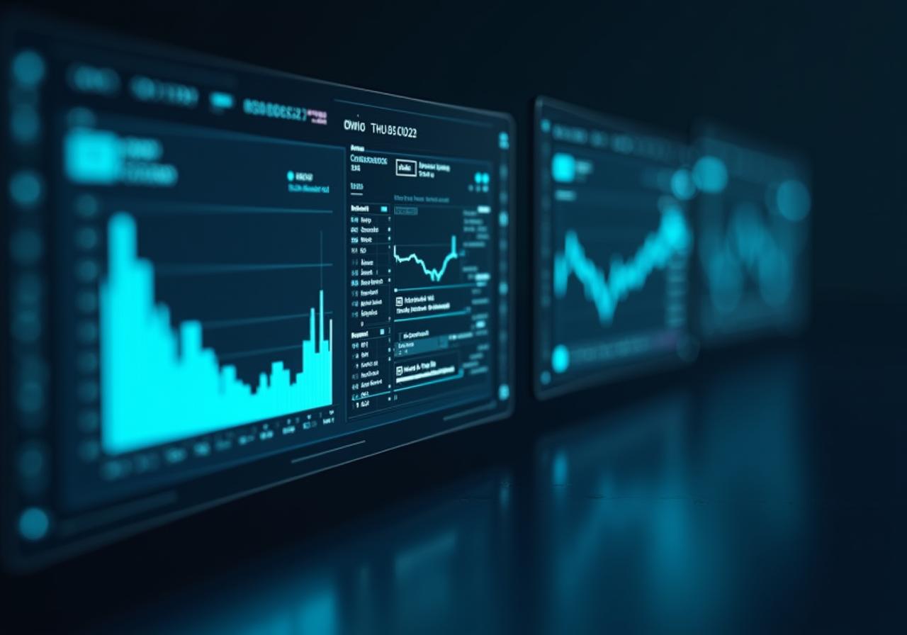
Data is only as valuable as its legibility. In an era of informational overload, a poorly designed dashboard isn't just an eyesore—it's a liability. When charts fail to communicate clear trends, decision-makers default to intuition rather than evidence. At NovaSight AI, we believe visualization is the bridge between raw telemetry and strategic intelligence.
01.Choosing the Right Chart Type
The foundation of visual hygiene is matching the data structure to the representation. Continuous data over time belongs in a line chart; comparisons across categories belong in a bar chart. Avoid using pie charts for more than three variables—they are notoriously difficult for the human brain to compare angles accurately.
Incorrect Choice
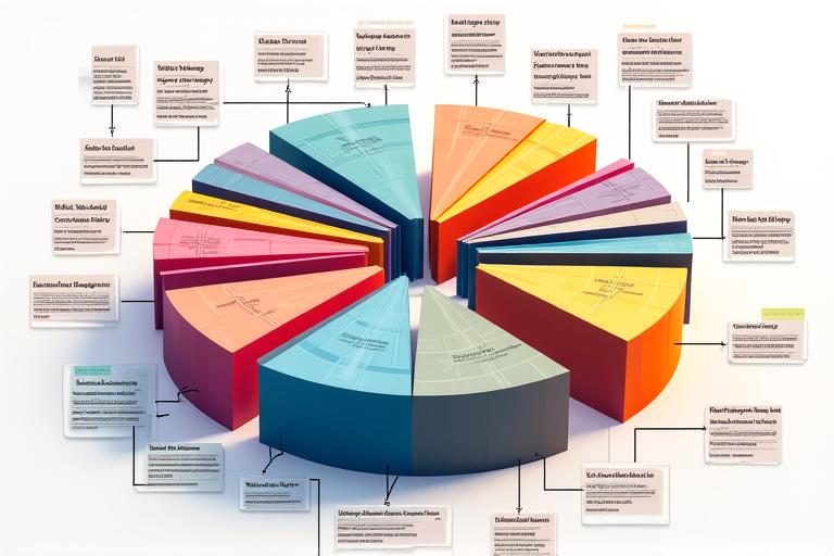
A pie chart with 15 categories makes it impossible to distinguish small differences in market share.
Better Choice
A ranked horizontal bar chart provides immediate clarity and allows for precise text labeling.
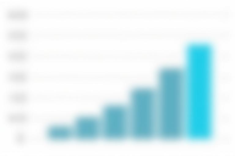
02. The Danger of 3D Effects and Clutter
Depth and perspective in a 2D interface distort the scale of data points. A 3D bar chart makes the bars in the background appear smaller than they are, while unnecessary grid lines and heavy borders add "chart junk" that distracts from the message. Keep labels horizontal for easier reading and use whitespace to let your data breathe.
03. Using Color Cognitively
In 2024, accessibility is non-negotiable. Use color to steer attention, not just to decorate. Avoid red and green as primary differentiators for color-blind users; instead, use high-contrast palettes from our brand guidelines (Cyan vs. Slate).
- Use contrast to highlight the most important data point.
- Avoid "Rainbow" palettes; they lack an inherent logical order.
Conclusion: Visual Hygiene
Effective visualization isn't about fancy graphics—it's about reducing the cognitive load on your users. By applying these principles, you ensure that every pixel on your dashboard serves a purpose. Ready to take your data to the next level? Request a Demo with NovaSight AI today.